In this chapter, we will show how we use the skrub TableReport to explore tabular data. We will use the Adult Census dataset as our example table, and perform some exploratory analysis to learn about the characteristics of the data.
2.2 Why do we need to do data exploration?
Before any kind of data processing or usage, we need to know what we are dealing with.
Useful information includes:
The size of the dataset.
The data types and names of the columns.
How values are distributed in each column.
Whether missing values are present, in what measure and where.
Which features are discrete/categorical, and how many categories there are.
Whether columns are strongly correlated with each other. …
2.3 Exploring data with Pandas
First, let’s load the dataset.
import pandas as pd# Load the Adult Census datasetdata = pd.read_csv("../data/adult_census/data.csv")target = pd.read_csv("../data/adult_census/target.csv")
Let’s first explore the data using Pandas only.
We can get an idea of the content of the table by printing the first few lines, which gives an idea of the datatypes and the columns we are dealing with.
data.head(5)
age
workclass
fnlwgt
education
education-num
marital-status
occupation
relationship
race
sex
capital-gain
capital-loss
hours-per-week
native-country
0
25
Private
226802
11th
7
Never-married
Machine-op-inspct
Own-child
Black
Male
0
0
40
United-States
1
38
Private
89814
HS-grad
9
Married-civ-spouse
Farming-fishing
Husband
White
Male
0
0
50
United-States
2
28
Local-gov
336951
Assoc-acdm
12
Married-civ-spouse
Protective-serv
Husband
White
Male
0
0
40
United-States
3
44
Private
160323
Some-college
10
Married-civ-spouse
Machine-op-inspct
Husband
Black
Male
7688
0
40
United-States
4
18
NaN
103497
Some-college
10
Never-married
NaN
Own-child
White
Female
0
0
30
United-States
We can use data.info() to find the shape of the dataframe, which dtypes are involved, the number of missing values and the size in memory of the dataframe.
We can also get a richer summary of the data with the .describe() method:
This gives us useful information about all the features in the dataset. Among others, we can find the number of unique values in each column, various statistics for the numerical columns and the number of null values.
data.describe(include="all")
age
workclass
fnlwgt
education
education-num
marital-status
occupation
relationship
race
sex
capital-gain
capital-loss
hours-per-week
native-country
count
48842.000000
46043
4.884200e+04
48842
48842.000000
48842
46033
48842
48842
48842
48842.000000
48842.000000
48842.000000
47985
unique
NaN
8
NaN
16
NaN
7
14
6
5
2
NaN
NaN
NaN
41
top
NaN
Private
NaN
HS-grad
NaN
Married-civ-spouse
Prof-specialty
Husband
White
Male
NaN
NaN
NaN
United-States
freq
NaN
33906
NaN
15784
NaN
22379
6172
19716
41762
32650
NaN
NaN
NaN
43832
mean
38.643585
NaN
1.896641e+05
NaN
10.078089
NaN
NaN
NaN
NaN
NaN
1079.067626
87.502314
40.422382
NaN
std
13.710510
NaN
1.056040e+05
NaN
2.570973
NaN
NaN
NaN
NaN
NaN
7452.019058
403.004552
12.391444
NaN
min
17.000000
NaN
1.228500e+04
NaN
1.000000
NaN
NaN
NaN
NaN
NaN
0.000000
0.000000
1.000000
NaN
25%
28.000000
NaN
1.175505e+05
NaN
9.000000
NaN
NaN
NaN
NaN
NaN
0.000000
0.000000
40.000000
NaN
50%
37.000000
NaN
1.781445e+05
NaN
10.000000
NaN
NaN
NaN
NaN
NaN
0.000000
0.000000
40.000000
NaN
75%
48.000000
NaN
2.376420e+05
NaN
12.000000
NaN
NaN
NaN
NaN
NaN
0.000000
0.000000
45.000000
NaN
max
90.000000
NaN
1.490400e+06
NaN
16.000000
NaN
NaN
NaN
NaN
NaN
99999.000000
4356.000000
99.000000
NaN
2.4 Exploring data with the skrub TableReport
Now, let’s create a TableReport to explore the dataset.
from skrub import TableReportTableReport(data, verbose=0)
Click a table cell for more info about its column.
No columns match the selected filter: . You can change the column filter in the dropdown menu above.
Column
Column name
dtype
Is sorted
Null values
Unique values
Mean
Std
Min
Median
Max
0
age
Int64DType
False
0 (0.0%)
74 (0.2%)
38.6
13.7
17
37
90
1
workclass
ObjectDType
False
2799 (5.7%)
8 (< 0.1%)
2
fnlwgt
Int64DType
False
0 (0.0%)
28523 (58.4%)
1.90e+05
1.06e+05
12,285
178,142
1,490,400
3
education
ObjectDType
False
0 (0.0%)
16 (< 0.1%)
4
education-num
Int64DType
False
0 (0.0%)
16 (< 0.1%)
10.1
2.57
1
10
16
5
marital-status
ObjectDType
False
0 (0.0%)
7 (< 0.1%)
6
occupation
ObjectDType
False
2809 (5.8%)
14 (< 0.1%)
7
relationship
ObjectDType
False
0 (0.0%)
6 (< 0.1%)
8
race
ObjectDType
False
0 (0.0%)
5 (< 0.1%)
9
sex
ObjectDType
False
0 (0.0%)
2 (< 0.1%)
10
capital-gain
Int64DType
False
0 (0.0%)
123 (0.3%)
1.08e+03
7.45e+03
0
0
99,999
11
capital-loss
Int64DType
False
0 (0.0%)
99 (0.2%)
87.5
403.
0
0
4,356
12
hours-per-week
Int64DType
False
0 (0.0%)
96 (0.2%)
40.4
12.4
1
40
99
13
native-country
ObjectDType
False
857 (1.8%)
41 (< 0.1%)
No columns match the selected filter: . You can change the column filter in the dropdown menu above.
To construct a list of column names that you can easily copy-paste
(in the box), select some columns using the checkboxes next
to the column names or the "Select all" button.
The table below shows the strength of association between the most similar columns in the dataframe.
Cramér's V statistic is a number between 0 and 1.
When it is close to 1 the columns are strongly associated — they contain similar information.
In this case, one of them may be redundant and for some models (such as linear models) it might be beneficial to remove it.
Please enable javascript
The skrub table reports need javascript to display correctly. If you are
displaying a report in a Jupyter notebook and you see this message, you may need to
re-execute the cell or to trust the notebook (button on the top right or
"File > Trust notebook").
Tip
If you’re working from a python console rather than a Jupyter notebook (or equivalent), the TableReport must be opened explicitly:
TableReport(data).open()
2.4.1 Default view of the TableReport
The TableReport gives us a comprehensive overview of the dataset. The default view shows all the columns in the dataset, and allows to select and copy the content of the cells shown in the preview.
The TableReport is intended to show a preview of the data, so it does not contain all the rows in the dataset, rather it shows only the first and last few rows by default. Similarly, it stores only the top 10 most frequent values for each column, if column distributions are plotted.
2.4.2 The “Stats” tab
TableReport(data, open_tab="stats")
Click a table cell for more info about its column.
No columns match the selected filter: . You can change the column filter in the dropdown menu above.
Column
Column name
dtype
Is sorted
Null values
Unique values
Mean
Std
Min
Median
Max
0
age
Int64DType
False
0 (0.0%)
74 (0.2%)
38.6
13.7
17
37
90
1
workclass
ObjectDType
False
2799 (5.7%)
8 (< 0.1%)
2
fnlwgt
Int64DType
False
0 (0.0%)
28523 (58.4%)
1.90e+05
1.06e+05
12,285
178,142
1,490,400
3
education
ObjectDType
False
0 (0.0%)
16 (< 0.1%)
4
education-num
Int64DType
False
0 (0.0%)
16 (< 0.1%)
10.1
2.57
1
10
16
5
marital-status
ObjectDType
False
0 (0.0%)
7 (< 0.1%)
6
occupation
ObjectDType
False
2809 (5.8%)
14 (< 0.1%)
7
relationship
ObjectDType
False
0 (0.0%)
6 (< 0.1%)
8
race
ObjectDType
False
0 (0.0%)
5 (< 0.1%)
9
sex
ObjectDType
False
0 (0.0%)
2 (< 0.1%)
10
capital-gain
Int64DType
False
0 (0.0%)
123 (0.3%)
1.08e+03
7.45e+03
0
0
99,999
11
capital-loss
Int64DType
False
0 (0.0%)
99 (0.2%)
87.5
403.
0
0
4,356
12
hours-per-week
Int64DType
False
0 (0.0%)
96 (0.2%)
40.4
12.4
1
40
99
13
native-country
ObjectDType
False
857 (1.8%)
41 (< 0.1%)
No columns match the selected filter: . You can change the column filter in the dropdown menu above.
To construct a list of column names that you can easily copy-paste
(in the box), select some columns using the checkboxes next
to the column names or the "Select all" button.
The table below shows the strength of association between the most similar columns in the dataframe.
Cramér's V statistic is a number between 0 and 1.
When it is close to 1 the columns are strongly associated — they contain similar information.
In this case, one of them may be redundant and for some models (such as linear models) it might be beneficial to remove it.
Please enable javascript
The skrub table reports need javascript to display correctly. If you are
displaying a report in a Jupyter notebook and you see this message, you may need to
re-execute the cell or to trust the notebook (button on the top right or
"File > Trust notebook").
The “Stats” tab provides a variety of descriptive statistics for each column in the dataset. This includes:
The column name
The detected data type of the column
Whether the column is sorted or not
The number of null values in the column, as well as the percentage
The number of unique values in the column
For numerical columns, additional statistics are provided:
Mean
Standard deviation
Minimum and maximum values
Median
Stat columns can also be sorted, for example to quickly identify which columns contain the most nulls, or have the largest cardinality (number of unique values).
2.4.3 The “Distributions” tab
TableReport(data, open_tab="distributions")
Click a table cell for more info about its column.
No columns match the selected filter: . You can change the column filter in the dropdown menu above.
Column
Column name
dtype
Is sorted
Null values
Unique values
Mean
Std
Min
Median
Max
0
age
Int64DType
False
0 (0.0%)
74 (0.2%)
38.6
13.7
17
37
90
1
workclass
ObjectDType
False
2799 (5.7%)
8 (< 0.1%)
2
fnlwgt
Int64DType
False
0 (0.0%)
28523 (58.4%)
1.90e+05
1.06e+05
12,285
178,142
1,490,400
3
education
ObjectDType
False
0 (0.0%)
16 (< 0.1%)
4
education-num
Int64DType
False
0 (0.0%)
16 (< 0.1%)
10.1
2.57
1
10
16
5
marital-status
ObjectDType
False
0 (0.0%)
7 (< 0.1%)
6
occupation
ObjectDType
False
2809 (5.8%)
14 (< 0.1%)
7
relationship
ObjectDType
False
0 (0.0%)
6 (< 0.1%)
8
race
ObjectDType
False
0 (0.0%)
5 (< 0.1%)
9
sex
ObjectDType
False
0 (0.0%)
2 (< 0.1%)
10
capital-gain
Int64DType
False
0 (0.0%)
123 (0.3%)
1.08e+03
7.45e+03
0
0
99,999
11
capital-loss
Int64DType
False
0 (0.0%)
99 (0.2%)
87.5
403.
0
0
4,356
12
hours-per-week
Int64DType
False
0 (0.0%)
96 (0.2%)
40.4
12.4
1
40
99
13
native-country
ObjectDType
False
857 (1.8%)
41 (< 0.1%)
No columns match the selected filter: . You can change the column filter in the dropdown menu above.
To construct a list of column names that you can easily copy-paste
(in the box), select some columns using the checkboxes next
to the column names or the "Select all" button.
The table below shows the strength of association between the most similar columns in the dataframe.
Cramér's V statistic is a number between 0 and 1.
When it is close to 1 the columns are strongly associated — they contain similar information.
In this case, one of them may be redundant and for some models (such as linear models) it might be beneficial to remove it.
Please enable javascript
The skrub table reports need javascript to display correctly. If you are
displaying a report in a Jupyter notebook and you see this message, you may need to
re-execute the cell or to trust the notebook (button on the top right or
"File > Trust notebook").
The “Distributions” tab provides visualizations of the distributions of values in each column. This includes histograms for numerical columns and bar plots for categorical columns.
The “Distributions” tab helps with detecting potential issues in the data, such as:
Skewed distributions
Outliers
Unexpected value frequencies
For example, in this dataset we can see that some columns are heavily skewed, such as “workclass”, “race”, and “native-country”: this is important information to keep track of, because these columns may require special handling during data preprocessing or modeling.
Additionally, the “Distributions” tab allows to select columns manually, so that they can be added to a script and selected for further analysis or modeling.
CautionOutlier detection
The TableReport detects outliers using a simple interquartile test, marking as outliers all values that are beyond the IQR. This is a simple heuristic, and should not be treated as perfect. If your problem requires reliable outlier detection, you should not rely exclusively on what the TableReport shows.
2.4.4 The “Associations” tab
TableReport(data, open_tab="associations")
Click a table cell for more info about its column.
No columns match the selected filter: . You can change the column filter in the dropdown menu above.
Column
Column name
dtype
Is sorted
Null values
Unique values
Mean
Std
Min
Median
Max
0
age
Int64DType
False
0 (0.0%)
74 (0.2%)
38.6
13.7
17
37
90
1
workclass
ObjectDType
False
2799 (5.7%)
8 (< 0.1%)
2
fnlwgt
Int64DType
False
0 (0.0%)
28523 (58.4%)
1.90e+05
1.06e+05
12,285
178,142
1,490,400
3
education
ObjectDType
False
0 (0.0%)
16 (< 0.1%)
4
education-num
Int64DType
False
0 (0.0%)
16 (< 0.1%)
10.1
2.57
1
10
16
5
marital-status
ObjectDType
False
0 (0.0%)
7 (< 0.1%)
6
occupation
ObjectDType
False
2809 (5.8%)
14 (< 0.1%)
7
relationship
ObjectDType
False
0 (0.0%)
6 (< 0.1%)
8
race
ObjectDType
False
0 (0.0%)
5 (< 0.1%)
9
sex
ObjectDType
False
0 (0.0%)
2 (< 0.1%)
10
capital-gain
Int64DType
False
0 (0.0%)
123 (0.3%)
1.08e+03
7.45e+03
0
0
99,999
11
capital-loss
Int64DType
False
0 (0.0%)
99 (0.2%)
87.5
403.
0
0
4,356
12
hours-per-week
Int64DType
False
0 (0.0%)
96 (0.2%)
40.4
12.4
1
40
99
13
native-country
ObjectDType
False
857 (1.8%)
41 (< 0.1%)
No columns match the selected filter: . You can change the column filter in the dropdown menu above.
To construct a list of column names that you can easily copy-paste
(in the box), select some columns using the checkboxes next
to the column names or the "Select all" button.
The table below shows the strength of association between the most similar columns in the dataframe.
Cramér's V statistic is a number between 0 and 1.
When it is close to 1 the columns are strongly associated — they contain similar information.
In this case, one of them may be redundant and for some models (such as linear models) it might be beneficial to remove it.
Please enable javascript
The skrub table reports need javascript to display correctly. If you are
displaying a report in a Jupyter notebook and you see this message, you may need to
re-execute the cell or to trust the notebook (button on the top right or
"File > Trust notebook").
The “Associations” tab provides insights into the relationships between different columns in the dataset. It shows Pearson’s correlation coefficient for numerical columns, as well as Cramér’s V for all columns.
While this is a somewhat rough measure of association, it can help identify potential relationships worth exploring further during the analysis, and highlights highly correlated columns: depending on the modeling technique used, these may need to be handled specially to avoid issues with multicollinearity.
In this example, we can see that “education-num” and “education” have perfect correlation, which means that one of the two columns can be dropped without losing information.
2.4.5 Filtering columns
The TableReport includes various column filters to display only specific columns. Filters can select columns by dtype (for example, to show only numeric columns), or by other characteristics (like the number of unique values, or the presence of missing values).
It is also possible to create custom filters to select columns based on a specific use case:
No columns match the selected filter: . You can change the column filter in the dropdown menu above.
Column
Column name
dtype
Is sorted
Null values
Unique values
Mean
Std
Min
Median
Max
0
age
Int64DType
False
0 (0.0%)
74 (0.2%)
38.6
13.7
17
37
90
1
workclass
ObjectDType
False
2799 (5.7%)
8 (< 0.1%)
2
fnlwgt
Int64DType
False
0 (0.0%)
28523 (58.4%)
1.90e+05
1.06e+05
12,285
178,142
1,490,400
3
education
ObjectDType
False
0 (0.0%)
16 (< 0.1%)
4
education-num
Int64DType
False
0 (0.0%)
16 (< 0.1%)
10.1
2.57
1
10
16
5
marital-status
ObjectDType
False
0 (0.0%)
7 (< 0.1%)
6
occupation
ObjectDType
False
2809 (5.8%)
14 (< 0.1%)
7
relationship
ObjectDType
False
0 (0.0%)
6 (< 0.1%)
8
race
ObjectDType
False
0 (0.0%)
5 (< 0.1%)
9
sex
ObjectDType
False
0 (0.0%)
2 (< 0.1%)
10
capital-gain
Int64DType
False
0 (0.0%)
123 (0.3%)
1.08e+03
7.45e+03
0
0
99,999
11
capital-loss
Int64DType
False
0 (0.0%)
99 (0.2%)
87.5
403.
0
0
4,356
12
hours-per-week
Int64DType
False
0 (0.0%)
96 (0.2%)
40.4
12.4
1
40
99
13
native-country
ObjectDType
False
857 (1.8%)
41 (< 0.1%)
No columns match the selected filter: . You can change the column filter in the dropdown menu above.
To construct a list of column names that you can easily copy-paste
(in the box), select some columns using the checkboxes next
to the column names or the "Select all" button.
The table below shows the strength of association between the most similar columns in the dataframe.
Cramér's V statistic is a number between 0 and 1.
When it is close to 1 the columns are strongly associated — they contain similar information.
In this case, one of them may be redundant and for some models (such as linear models) it might be beneficial to remove it.
Please enable javascript
The skrub table reports need javascript to display correctly. If you are
displaying a report in a Jupyter notebook and you see this message, you may need to
re-execute the cell or to trust the notebook (button on the top right or
"File > Trust notebook").
Skrub selectors can be used for that (more on that later).
2.5 Exploring the target variable
Besides dataframes, the TableReport handles series and mono- and bi-dimensional numpy arrays.
So, let’s take a closer look at the target variable, which indicates whether an individual’s income exceeds $50K per year. We can create a separate TableReport for the target variable to explore its distribution:
TableReport(target)
Click a table cell for more info about its column.
class
0
<=50K
1
<=50K
2
>50K
3
>50K
4
<=50K
48,837
<=50K
48,838
>50K
48,839
<=50K
48,840
<=50K
48,841
>50K
class
ObjectDType
Null values
0 (0.0%)
Unique values
2 (< 0.1%)
Most frequent values
<=50K
>50K
List:
['<=50K', '>50K']
No columns match the selected filter: . You can change the column filter in the dropdown menu above.
Column
Column name
dtype
Is sorted
Null values
Unique values
Mean
Std
Min
Median
Max
0
class
ObjectDType
False
0 (0.0%)
2 (< 0.1%)
No columns match the selected filter: . You can change the column filter in the dropdown menu above.
To construct a list of column names that you can easily copy-paste
(in the box), select some columns using the checkboxes next
to the column names or the "Select all" button.
class
ObjectDType
Null values
0 (0.0%)
Unique values
2 (< 0.1%)
Most frequent values
<=50K
>50K
List:
['<=50K', '>50K']
No columns match the selected filter: . You can change the column filter in the dropdown menu above.
No associations were computed because the dataframe has only one column.
Please enable javascript
The skrub table reports need javascript to display correctly. If you are
displaying a report in a Jupyter notebook and you see this message, you may need to
re-execute the cell or to trust the notebook (button on the top right or
"File > Trust notebook").
2.6 Working with big tables
Plotting and measuring the column correlations are expensive operations and may take a long time for large tables; in these cases it may be beneficial to disable these features when developing and enabling them only when the dataframe has been processed.
By default, both features are disabled when the given dataframe has more than 30 columns, but this behavior can be changed by setting the respective parameters to either True (to always plot/compute associations) or `False (to disable the features entirely):
Click a table cell for more info about its column.
age
workclass
fnlwgt
education
education-num
marital-status
occupation
relationship
race
sex
capital-gain
capital-loss
hours-per-week
native-country
0
25
Private
226,802
11th
7
Never-married
Machine-op-inspct
Own-child
Black
Male
0
0
40
United-States
1
38
Private
89,814
HS-grad
9
Married-civ-spouse
Farming-fishing
Husband
White
Male
0
0
50
United-States
2
28
Local-gov
336,951
Assoc-acdm
12
Married-civ-spouse
Protective-serv
Husband
White
Male
0
0
40
United-States
3
44
Private
160,323
Some-college
10
Married-civ-spouse
Machine-op-inspct
Husband
Black
Male
7,688
0
40
United-States
4
18
103,497
Some-college
10
Never-married
Own-child
White
Female
0
0
30
United-States
48,837
27
Private
257,302
Assoc-acdm
12
Married-civ-spouse
Tech-support
Wife
White
Female
0
0
38
United-States
48,838
40
Private
154,374
HS-grad
9
Married-civ-spouse
Machine-op-inspct
Husband
White
Male
0
0
40
United-States
48,839
58
Private
151,910
HS-grad
9
Widowed
Adm-clerical
Unmarried
White
Female
0
0
40
United-States
48,840
22
Private
201,490
HS-grad
9
Never-married
Adm-clerical
Own-child
White
Male
0
0
20
United-States
48,841
52
Self-emp-inc
287,927
HS-grad
9
Married-civ-spouse
Exec-managerial
Wife
White
Female
15,024
0
40
United-States
age
Int64DType
Null values
0 (0.0%)
Unique values
74 (0.2%)
This column has a high cardinality (> 40).
Mean ± Std
38.6 ±
13.7
Median ± IQR
37 ±
20
Min | Max
17 |
90
workclass
ObjectDType
Null values
2,799 (5.7%)
Unique values
8 (< 0.1%)
fnlwgt
Int64DType
Null values
0 (0.0%)
Unique values
28,523 (58.4%)
This column has a high cardinality (> 40).
Mean ± Std
1.90e+05 ±
1.06e+05
Median ± IQR
178,142 ±
120,097
Min | Max
12,285 |
1,490,400
education
ObjectDType
Null values
0 (0.0%)
Unique values
16 (< 0.1%)
education-num
Int64DType
Null values
0 (0.0%)
Unique values
16 (< 0.1%)
Mean ± Std
10.1 ±
2.57
Median ± IQR
10 ±
3
Min | Max
1 |
16
marital-status
ObjectDType
Null values
0 (0.0%)
Unique values
7 (< 0.1%)
occupation
ObjectDType
Null values
2,809 (5.8%)
Unique values
14 (< 0.1%)
relationship
ObjectDType
Null values
0 (0.0%)
Unique values
6 (< 0.1%)
race
ObjectDType
Null values
0 (0.0%)
Unique values
5 (< 0.1%)
sex
ObjectDType
Null values
0 (0.0%)
Unique values
2 (< 0.1%)
capital-gain
Int64DType
Null values
0 (0.0%)
Unique values
123 (0.3%)
This column has a high cardinality (> 40).
Mean ± Std
1.08e+03 ±
7.45e+03
Median ± IQR
0 ±
0
Min | Max
0 |
99,999
capital-loss
Int64DType
Null values
0 (0.0%)
Unique values
99 (0.2%)
This column has a high cardinality (> 40).
Mean ± Std
87.5 ±
403.
Median ± IQR
0 ±
0
Min | Max
0 |
4,356
hours-per-week
Int64DType
Null values
0 (0.0%)
Unique values
96 (0.2%)
This column has a high cardinality (> 40).
Mean ± Std
40.4 ±
12.4
Median ± IQR
40 ±
5
Min | Max
1 |
99
native-country
ObjectDType
Null values
857 (1.8%)
Unique values
41 (< 0.1%)
This column has a high cardinality (> 40).
No columns match the selected filter: . You can change the column filter in the dropdown menu above.
Column
Column name
dtype
Is sorted
Null values
Unique values
Mean
Std
Min
Median
Max
0
age
Int64DType
False
0 (0.0%)
74 (0.2%)
38.6
13.7
17
37
90
1
workclass
ObjectDType
False
2799 (5.7%)
8 (< 0.1%)
2
fnlwgt
Int64DType
False
0 (0.0%)
28523 (58.4%)
1.90e+05
1.06e+05
12,285
178,142
1,490,400
3
education
ObjectDType
False
0 (0.0%)
16 (< 0.1%)
4
education-num
Int64DType
False
0 (0.0%)
16 (< 0.1%)
10.1
2.57
1
10
16
5
marital-status
ObjectDType
False
0 (0.0%)
7 (< 0.1%)
6
occupation
ObjectDType
False
2809 (5.8%)
14 (< 0.1%)
7
relationship
ObjectDType
False
0 (0.0%)
6 (< 0.1%)
8
race
ObjectDType
False
0 (0.0%)
5 (< 0.1%)
9
sex
ObjectDType
False
0 (0.0%)
2 (< 0.1%)
10
capital-gain
Int64DType
False
0 (0.0%)
123 (0.3%)
1.08e+03
7.45e+03
0
0
99,999
11
capital-loss
Int64DType
False
0 (0.0%)
99 (0.2%)
87.5
403.
0
0
4,356
12
hours-per-week
Int64DType
False
0 (0.0%)
96 (0.2%)
40.4
12.4
1
40
99
13
native-country
ObjectDType
False
857 (1.8%)
41 (< 0.1%)
No columns match the selected filter: . You can change the column filter in the dropdown menu above.
To construct a list of column names that you can easily copy-paste
(in the box), select some columns using the checkboxes next
to the column names or the "Select all" button.
Plotting was skipped. This is due to either:
The dataframe exceeding the configured
table_report_plots_threshold
limit (default: 30).
The plot_distributions option being set to False (default: "auto", which applies the configured table_report_plots_threshold).
You can adjust this behavior in several ways:
To force plotting for a single report:
report = TableReport(df, plot_distributions=True)
To change the threshold for the current Python session, use skrub.set_config:
    from skrub import set_config
    set_config(table_report_plots_threshold=50)
To make the change permanent, use an environment variable:
export SKB_TABLE_REPORT_PLOTS_THRESHOLD=50
No columns match the selected filter: . You can change the column filter in the dropdown menu above.
Computing pairwise associations was skipped. This is due to either:
The dataframe exceeding the configured
table_report_associations_threshold
limit (default: 30).
The compute_associations option being set to False (default: "auto", which applies the configured table_report_associations_threshold).
To change the threshold for the current Python session, use skrub.set_config:
    from skrub import set_config
    set_config(table_report_associations_threshold=50)
To make the change permanent, use an environment variable:
export SKB_TABLE_REPORT_ASSOCIATIONS_THRESHOLD=50
Please enable javascript
The skrub table reports need javascript to display correctly. If you are
displaying a report in a Jupyter notebook and you see this message, you may need to
re-execute the cell or to trust the notebook (button on the top right or
"File > Trust notebook").
It is also possible to change the column threshold from 30 to a different value using the skrub configuration and the table_report_plots_threshold and table_report_associations_threshold parameters:
from skrub import set_configset_config(table_report_plots_threshold=10)
As with all other skrub configuration parameters, a new default value can be set by using the proper environemntal variables. More detail on the skrub configuration is reported in the User Guide.
2.7 Exporting the TableReport
The TableReport measures a number of statistics that can be used for more than just exploration: for example, they may be provided to other programs for alternative plotting, or shared outside of the starting notebook.
The entire report can be exported as a standalone HTML page that includes all the features:
TableReport(data).write_html("report.html")
Then, the report can be opened using any internet browser, with no need to run a Jupyter notebok or a python interactive console.
Alternatively, the report can be exported in JSON format: this allows to forward it to other programs for programmatic access to the statistics gathered by the report.
json_str = TableReport(data).json()withopen("report.json", "w") as fp: fp.write(json_str)
The JSON exported by the report will contain all the distribution plots in SVG format, which may not be necessary for some applications. To avoid exporting the plots, set plot_distributions=False.
Finally, the report can be exported in summarized form as a Markdown-formatted string, which can be useful to share as a message, printed on a command line, or fed to agents ask for insights.
md_str = TableReport(data).markdown()withopen("report.md", "w") as fp: fp.write(md_str)
Warning
The TableReport does not do any sanitization of the input data, and prints out column names and most frequent values as part of the output. Do not feed the content of the report to an agent if the dataset is large, or if its content is not trusted.
2.8 Replacing the default dataframe _repr_
It is possible to use the TableReport instead of the default dataframe representation used by Pandas and Polars with patch_display:
from skrub import patch_display, unpatch_display# replace the default pandas repr patch_display()data.head()
No columns match the selected filter: . You can change the column filter in the dropdown menu above.
Column
Column name
dtype
Is sorted
Null values
Unique values
Mean
Std
Min
Median
Max
0
age
Int64DType
False
0 (0.0%)
5 (100.0%)
30.6
10.4
18
28
44
1
workclass
ObjectDType
False
1 (20.0%)
2 (40.0%)
2
fnlwgt
Int64DType
False
0 (0.0%)
5 (100.0%)
1.83e+05
1.01e+05
89,814
160,323
336,951
3
education
ObjectDType
False
0 (0.0%)
4 (80.0%)
4
education-num
Int64DType
False
0 (0.0%)
4 (80.0%)
9.60
1.82
7
10
12
5
marital-status
ObjectDType
False
0 (0.0%)
2 (40.0%)
6
occupation
ObjectDType
False
1 (20.0%)
3 (60.0%)
7
relationship
ObjectDType
False
0 (0.0%)
2 (40.0%)
8
race
ObjectDType
False
0 (0.0%)
2 (40.0%)
9
sex
ObjectDType
True
0 (0.0%)
2 (40.0%)
10
capital-gain
Int64DType
False
0 (0.0%)
2 (40.0%)
1.54e+03
3.44e+03
0
0
7,688
11
capital-loss
Int64DType
True
0 (0.0%)
1 (20.0%)
0.00
0.00
12
hours-per-week
Int64DType
False
0 (0.0%)
3 (60.0%)
40.0
7.07
30
40
50
13
native-country
ObjectDType
True
0 (0.0%)
1 (20.0%)
No columns match the selected filter: . You can change the column filter in the dropdown menu above.
To construct a list of column names that you can easily copy-paste
(in the box), select some columns using the checkboxes next
to the column names or the "Select all" button.
The table below shows the strength of association between the most similar columns in the dataframe.
Cramér's V statistic is a number between 0 and 1.
When it is close to 1 the columns are strongly associated — they contain similar information.
In this case, one of them may be redundant and for some models (such as linear models) it might be beneficial to remove it.
Please enable javascript
The skrub table reports need javascript to display correctly. If you are
displaying a report in a Jupyter notebook and you see this message, you may need to
re-execute the cell or to trust the notebook (button on the top right or
"File > Trust notebook").
To disable, use unpatch_display:
unpatch_display()data
age
workclass
fnlwgt
education
education-num
marital-status
occupation
relationship
race
sex
capital-gain
capital-loss
hours-per-week
native-country
0
25
Private
226802
11th
7
Never-married
Machine-op-inspct
Own-child
Black
Male
0
0
40
United-States
1
38
Private
89814
HS-grad
9
Married-civ-spouse
Farming-fishing
Husband
White
Male
0
0
50
United-States
2
28
Local-gov
336951
Assoc-acdm
12
Married-civ-spouse
Protective-serv
Husband
White
Male
0
0
40
United-States
3
44
Private
160323
Some-college
10
Married-civ-spouse
Machine-op-inspct
Husband
Black
Male
7688
0
40
United-States
4
18
NaN
103497
Some-college
10
Never-married
NaN
Own-child
White
Female
0
0
30
United-States
...
...
...
...
...
...
...
...
...
...
...
...
...
...
...
48837
27
Private
257302
Assoc-acdm
12
Married-civ-spouse
Tech-support
Wife
White
Female
0
0
38
United-States
48838
40
Private
154374
HS-grad
9
Married-civ-spouse
Machine-op-inspct
Husband
White
Male
0
0
40
United-States
48839
58
Private
151910
HS-grad
9
Widowed
Adm-clerical
Unmarried
White
Female
0
0
40
United-States
48840
22
Private
201490
HS-grad
9
Never-married
Adm-clerical
Own-child
White
Male
0
0
20
United-States
48841
52
Self-emp-inc
287927
HS-grad
9
Married-civ-spouse
Exec-managerial
Wife
White
Female
15024
0
40
United-States
48842 rows × 14 columns
Warning
After patching, calling methods like df.head() will generate the report only on the relative few lines of the dataframe, thus making stats and distributions unreliable.
2.9 What we have seen in this chapter
In this chapter we have learned how the TableReport can be used to speed up data exploration, allowing us to find possible criticalities in the data.
We covered:
Creating and configuring a TableReport for fast, interactive data exploration
Exploring column statistics, value distributions, and associations visually
Detecting nulls, outliers, and highly correlated columns at a glance
Filtering columns by type or characteristics using built-in filters
Saving and sharing reports as HTML, JSON, and Markdown files
Adjusting TableReport settings for large datasets to optimize performance
In the next chapter, we will find out how to address some of the possible problems using the skrub Cleaner.
Source Code
---title: "Exploring dataframes with skrub"format: html: toc: true revealjs: slide-number: true toc: false code-fold: false code-tools: true footer: "[← Back to Slides Index](../../slides/index.html)"---## IntroductionIn this chapter, we will show how we use the skrub `TableReport` to exploretabular data. We will use the Adult Census dataset as our example table, and perform some exploratory analysis to learn about the characteristics of the data. ## Why do we need to do data exploration? {.smaller}Before any kind of data processing or usage, we need to know what we are dealing with. Useful information includes:- The size of the dataset. - The data types and names of the columns. - How values are distributed in each column. - Whether missing values are present, in what measure and where. - Which features are discrete/categorical, and how many categories there are.- Whether columns are strongly correlated with each other. ...## Exploring data with PandasFirst, let's load the dataset.```{python}import pandas as pd# Load the Adult Census datasetdata = pd.read_csv("../data/adult_census/data.csv")target = pd.read_csv("../data/adult_census/target.csv")```Let's first explore the data using Pandas only.We can get an idea of the content of the table by printing the first few lines, which gives an idea of the datatypes and the columns we are dealing with. ```{python}data.head(5)```We can use `data.info()` to find the shape of the dataframe, which dtypes are involved, the number of missing values and the size in memory of the dataframe. ```{python}data.info()```We can also get a richer summary of the data with the `.describe()` method:This gives us useful information about all the features in the dataset. Among others, we can find the number of unique values in each column, various statisticsfor the numerical columns and the number of null values.```{python}data.describe(include="all")```## Exploring data with the skrub `TableReport`Now, let's create a TableReport to explore the dataset.```{python}from skrub import TableReportTableReport(data, verbose=0)```::: {.callout-tip}If you're working from a python console rather than a Jupyter notebook (or equivalent), the `TableReport` must be opened explicitly:```pythonTableReport(data).open()```:::### Default view of the TableReportThe `TableReport` gives us a comprehensive overview of the dataset. The defaultview shows all the columns in the dataset, and allows to select and copy the contentof the cells shown in the preview. The `TableReport` is intended to show a preview of the data, so it does not contain all the rows in the dataset, rather it shows only the first and lastfew rows by default. Similarly, it stores only the top 10 most frequent valuesfor each column, if column distributions are plotted.### The "Stats" tab```{python}TableReport(data, open_tab="stats")```The "Stats" tab provides a variety of descriptive statistics for each column inthe dataset.This includes:- The column name- The detected data type of the column- Whether the column is sorted or not - The number of null values in the column, as well as the percentage- The number of unique values in the columnFor numerical columns, additional statistics are provided:- Mean- Standard deviation- Minimum and maximum values- MedianStat columns can also be sorted, for example to quickly identify which columns contain the most nulls, or have the largest cardinality (number of unique values).### The "Distributions" tab```{python}TableReport(data, open_tab="distributions")```The "Distributions" tab provides visualizations of the distributions of values in each column. This includes histograms for numerical columns and bar plots forcategorical columns.The "Distributions" tab helps with detecting potential issues in the data, such as:- Skewed distributions- Outliers- Unexpected value frequenciesFor example, in this dataset we can see that some columns are heavily skewed, such as "workclass", "race", and "native-country": this is important information to keep track of, because these columns may require special handlingduring data preprocessing or modeling.Additionally, the "Distributions" tab allows to select columns manually, so thatthey can be added to a script and selected for further analysis or modeling.::: {.callout-caution}#### Outlier detectionThe `TableReport` detects outliers using a simple interquartile test, marking as outliers all values that are beyond the IQR. This is a simple heuristic, and should not be treated as perfect. If your problem requires reliable outlier detection, you should not rely exclusively on what the `TableReport` shows. :::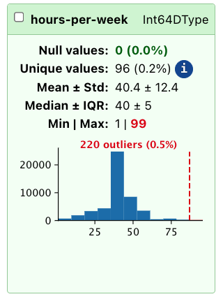### The "Associations" tab```{python}TableReport(data, open_tab="associations")```The "Associations" tab provides insights into the relationships between differentcolumns in the dataset.It shows [Pearson's correlation](https://en.wikipedia.org/wiki/Pearson_correlation_coefficient)coefficient for numerical columns, as well as [Cramér's V](https://en.wikipedia.org/wiki/Cram%C3%A9r%27s_V) for all columns. While this is a somewhat rough measure of association, it can help identify potentialrelationships worth exploring further during the analysis, and highlights highly correlated columns: depending on the modeling technique used, these may need to be handled specially to avoid issues with multicollinearity.In this example, we can see that "education-num" and "education" have perfect correlation, which means that one of the two columns can be dropped without losinginformation.### Filtering columnsThe `TableReport` includes various column filters to display only specific columns.Filters can select columns by dtype (for example, to show only numeric columns), or by other characteristics (like the number of unique values, or the presenceof missing values). It is also possible to create custom filters to select columns based on a specificuse case:```{python}my_filter = {"only_education": ["education", "education-num"]}TableReport(data, column_filters=my_filter)```Skrub selectors can be used for that (more on that later).## Exploring the target variableBesides dataframes, the `TableReport` handles series and mono- and bi-dimensional numpy arrays.So, let's take a closer look at the target variable, which indicates whether anindividual's income exceeds $50K per year. We can create a separate `TableReport`for the target variable to explore its distribution: ```{python}TableReport(target)```## Working with big tablesPlotting and measuring the column correlations are expensive operations and maytake a long time for large tables; in these cases it may be beneficial to disable these features when developing and enabling them only whenthe dataframe has been processed. By default, both features are disabled when the given dataframe has more than 30columns, but this behavior can be changed by setting the respective parametersto either `True` (to always plot/compute associations) or `False (to disable the features entirely):```{python}TableReport( data, plot_distributions=False, compute_associations=False, open_tab="distributions")```It is also possible to change the column threshold from 30 to a different valueusing the skrub configuration and the `table_report_plots_threshold` and `table_report_associations_threshold` parameters: ```pythonfrom skrub import set_configset_config(table_report_plots_threshold=10)```As with all other skrub configuration parameters, a new default value can be setby using the proper environemntal variables. More detail on the skrub configuration is reported in the [User Guide](https://skrub-data.org/dev/modules/configuration_and_utils/customizing_configuration.html).## Exporting the `TableReport` The `TableReport` measures a number of statistics that can be used for more than just exploration: for example, they may be providedto other programs for alternative plotting, or shared outside of the starting notebook.The entire report can be exported as a standalone **HTML** page that includes all the features:```{.python}TableReport(data).write_html("report.html")```Then, the report can be opened using any internet browser, with no need to run a Jupyter notebok or a python interactive console. Alternatively, the report can be exported in **JSON** format: this allows to forward it to other programs for programmatic access to the statistics gathered by the report. ```pythonjson_str = TableReport(data).json()withopen("report.json", "w") as fp: fp.write(json_str)```::: {callout-important}The JSON exported by the report will contain all the distribution plots in SVG format, which may not be necessary for some applications. To avoid exporting theplots, set `plot_distributions=False`. :::Finally, the report can be exported in summarized form as a **Markdown**-formatted string, which can be useful to share as a message, printed on a command line, or fed to agents ask for insights. ```pythonmd_str = TableReport(data).markdown()withopen("report.md", "w") as fp: fp.write(md_str)```::: {.callout-warning}The `TableReport` does not do any sanitization of the input data, and prints outcolumn names and most frequent values as part of the output. Do not feed the contentof the report to an agent if the dataset is large, or if its content is not trusted.:::## Replacing the default dataframe `_repr_` It is possible to use the `TableReport` instead of the default dataframe representationused by Pandas and Polars with `patch_display`:```{python}from skrub import patch_display, unpatch_display# replace the default pandas repr patch_display()data.head()```To disable, use `unpatch_display`:```{python}unpatch_display()data```::: {.callout-warning}After patching, calling methods like `df.head()` will generate the report **only on the relative few lines of the dataframe**, thus making stats and distributionsunreliable. :::## What we have seen in this chapter {.smaller}In this chapter we have learned how the `TableReport` can be used to speed up data exploration, allowing us to find possible criticalities in the data. We covered:- Creating and configuring a `TableReport` for fast, interactive data exploration- Exploring column statistics, value distributions, and associations visually- Detecting nulls, outliers, and highly correlated columns at a glance- Filtering columns by type or characteristics using built-in filters- Saving and sharing reports as HTML, JSON, and Markdown files- Adjusting `TableReport` settings for large datasets to optimize performanceIn the next chapter, we will find out how to address some of the possible problems using the skrub `Cleaner`.
