
Note
Go to the end to download the full example code. or to run this example in your browser via JupyterLite or Binder
Interpolation join: infer missing rows when joining two tables#
We illustrate the InterpolationJoiner, which is a type of join where
values from the second table are inferred with machine-learning, rather than looked up
in the table. It is useful when exact matches are not available but we have rows that
are close enough to make an educated guess – in this sense it is a generalization of a
fuzzy_join().
The InterpolationJoiner is therefore a transformer that adds the outputs
of one or more machine-learning models as new columns to the table it operates on.
In this example we want our transformer to add weather data (temperature, rain, etc.) to the table it operates on. We have a table containing information about commercial flights, and we want to add information about the weather at the time and place where each flight took off. This could be useful to predict delays – flights are often delayed by bad weather.
We have a table of weather data containing, at many weather stations, measurements such
as temperature, rain and snow at many time points. Unfortunately, our weather stations
are not inside the airports, and the measurements are not timed according to the flight
schedule. Therefore, a simple equi-join would not yield any matching pair of rows from
our two tables. Instead, we use the InterpolationJoiner to infer the
temperature at the airport at take-off time. We train supervised
machine-learning models using the weather table, then query them with the times
and locations in the flights table.
Load weather data#
We join the table containing the measurements to the table that contains the weather stations’ latitude and longitude. We subsample these large tables for the example to run faster.
import pandas as pd

from skrub.datasets import fetch_flight_delays

dataset = fetch_flight_delays()
weather = dataset.weather
weather = weather.sample(100_000, random_state=0, ignore_index=True)
stations = dataset.stations
weather = stations.merge(weather, on="ID")[
    ["LATITUDE", "LONGITUDE", "YEAR/MONTH/DAY", "TMAX", "PRCP", "SNOW"]
]
weather["YEAR/MONTH/DAY"] = pd.to_datetime(weather["YEAR/MONTH/DAY"])
The 'TMAX' is in tenths of degree Celsius – a 'TMAX' of 297 means the maximum
temperature that day was 29.7℃. We convert it to degrees for readability
weather["TMAX"] /= 10
InterpolationJoiner with a ground truth: joining the weather table on itself#
As a first simple example, we apply the InterpolationJoiner in a
situation where the ground truth is known. We split the weather table in half and join
the second half on the first half. Thus, the values from the right side table of the
join are inferred, whereas the corresponding columns from the left side contain the
ground truth and we can compare them.
n_main = weather.shape[0] // 2
main_table = weather.iloc[:n_main]
main_table.head()
Joining the tables#
Now we join our two tables and check how well the InterpolationJoiner
can reconstruct the matching rows that are missing from the right side table. To avoid
clashes in the column names, we use the suffix parameter to append "predicted"
to the right side table column names.
from skrub import InterpolationJoiner

joiner = InterpolationJoiner(
    aux_table,
    key=["LATITUDE", "LONGITUDE", "YEAR/MONTH/DAY"],
    suffix="_predicted",
).fit(main_table)
join = joiner.transform(main_table)
join.head()
Comparing the estimated values to the ground truth#
from matplotlib import pyplot as plt

join = join.sample(2000, random_state=0, ignore_index=True)
fig, axes = plt.subplots(
    3,
    1,
    figsize=(5, 9),
    gridspec_kw={"height_ratios": [1.0, 0.5, 0.5]},
    layout="compressed",
)
for ax, col in zip(axes.ravel(), ["TMAX", "PRCP", "SNOW"]):
    ax.scatter(
        join[col].values,
        join[f"{col}_predicted"].values,
        alpha=0.1,
    )
    ax.set_aspect(1)
    ax.set_xlabel(f"true {col}")
    ax.set_ylabel(f"predicted {col}")
plt.show()
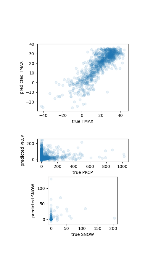
We see that in this case the interpolation join works well for the temperature, but not precipitation nor snow. So we will only add the temperature to our flights table.
aux_table = aux_table.drop(["PRCP", "SNOW"], axis=1)
Loading the flights table#
We load the flights table and join it to the airports table using the flights’
'Origin' which refers to the departure airport’s IATA code. We use only a subset
to speed up the example.
flights = dataset.flights
flights["Year_Month_DayofMonth"] = pd.to_datetime(flights["Year_Month_DayofMonth"])
flights = flights[["Year_Month_DayofMonth", "Origin", "ArrDelay"]]
flights = flights.sample(20_000, random_state=0, ignore_index=True)
airports = dataset.airports[["iata", "airport", "state", "lat", "long"]]
flights = flights.merge(airports, left_on="Origin", right_on="iata")
# printing the first row is more readable than the head() when we have many columns
flights.iloc[0]
Year_Month_DayofMonth                  2008-02-24 00:00:00
Origin                                                 DTW
ArrDelay                                              35.0
iata                                                   DTW
airport                  Detroit Metropolitan-Wayne County
state                                                   MI
lat                                              42.212059
long                                            -83.348836
Name: 0, dtype: object
Joining the flights and weather data#
As before, we initialize our join transformer with the weather table. Then, we use it
to transform the flights table – it adds a 'TMAX' column containing the predicted
maximum daily temperature.
joiner = InterpolationJoiner(
    aux_table,
    main_key=["lat", "long", "Year_Month_DayofMonth"],
    aux_key=["LATITUDE", "LONGITUDE", "YEAR/MONTH/DAY"],
)
join = joiner.fit_transform(flights)
join.head()
Sanity checks#
This time we do not have a ground truth for the temperatures. We can perform a few basic sanity checks.
state_temperatures = join.groupby("state")["TMAX"].mean().sort_values()
States with the lowest average predicted temperatures: Alaska, Montana, North Dakota, Washington, Minnesota.
state
AK   -3.102327
MT    0.582221
ND    1.455610
MN    1.602369
WA    1.738994
Name: TMAX, dtype: float64
States with the highest predicted temperatures: Puerto Rico, Virgin Islands, Hawaii, Florida, Louisiana.
state
AZ    21.096758
FL    24.992225
HI    27.592300
VI    29.817824
PR    30.338244
Name: TMAX, dtype: float64
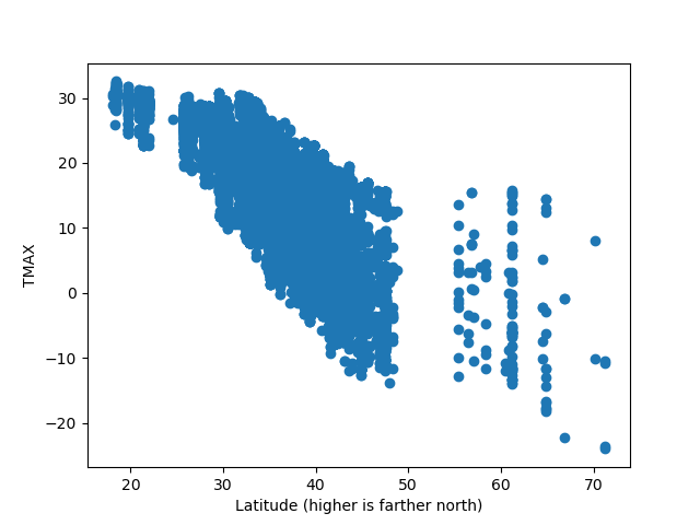
Higher latitudes (farther up north) are colder – the airports in this dataset are in the United States.
fig, ax = plt.subplots()
ax.scatter(join["lat"], join["TMAX"])
ax.set_xlabel("Latitude (higher is farther north)")
ax.set_ylabel("TMAX")
plt.show()
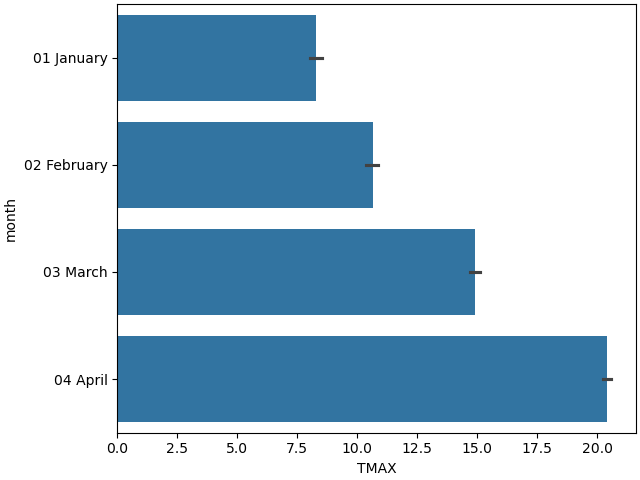
Winter months are colder than spring – in the north hemisphere January is colder than April
import seaborn as sns

join["month"] = join["Year_Month_DayofMonth"].dt.strftime("%m %B")
plt.figure(layout="constrained")
sns.barplot(data=join.sort_values(by="month"), y="month", x="TMAX")
plt.show()
Of course these checks do not guarantee that the inferred values in our join
table’s 'TMAX' column are accurate. But at least the
InterpolationJoiner seems to have learned a few reasonable trends from
its training table.
Conclusion#
We have seen how to fit an InterpolationJoiner transformer: we give it
a table (the weather data) and a set of matching columns (here date, latitude,
longitude) and it learns to predict the other columns’ values (such as the max daily
temperature). Then, it transforms tables by predicting values that a matching row
would contain, rather than by searching for an actual match. It is a generalization of
the fuzzy_join(), as fuzzy_join() is the same thing as an
InterpolationJoiner where the estimators are 1-nearest-neighbor
estimators.
Total running time of the script: (0 minutes 11.355 seconds)